FULL CIRCLE

The process of making has almost to come to an end but the journey of the object has just begun. The jewellery objects from the collection 'Daag' carry stories of their making to the wearer. The wearer then leaves their mark on the objects, just as the maker did, closing the loop. This is the reason the objects had to be showcased in a way that aligned with the concept of 'Daag' - Unfurl and Split. Scatter. Burst (Check the previous post : Making of 'Daag'). This was where the first stories were created. I was going back to the starting point.
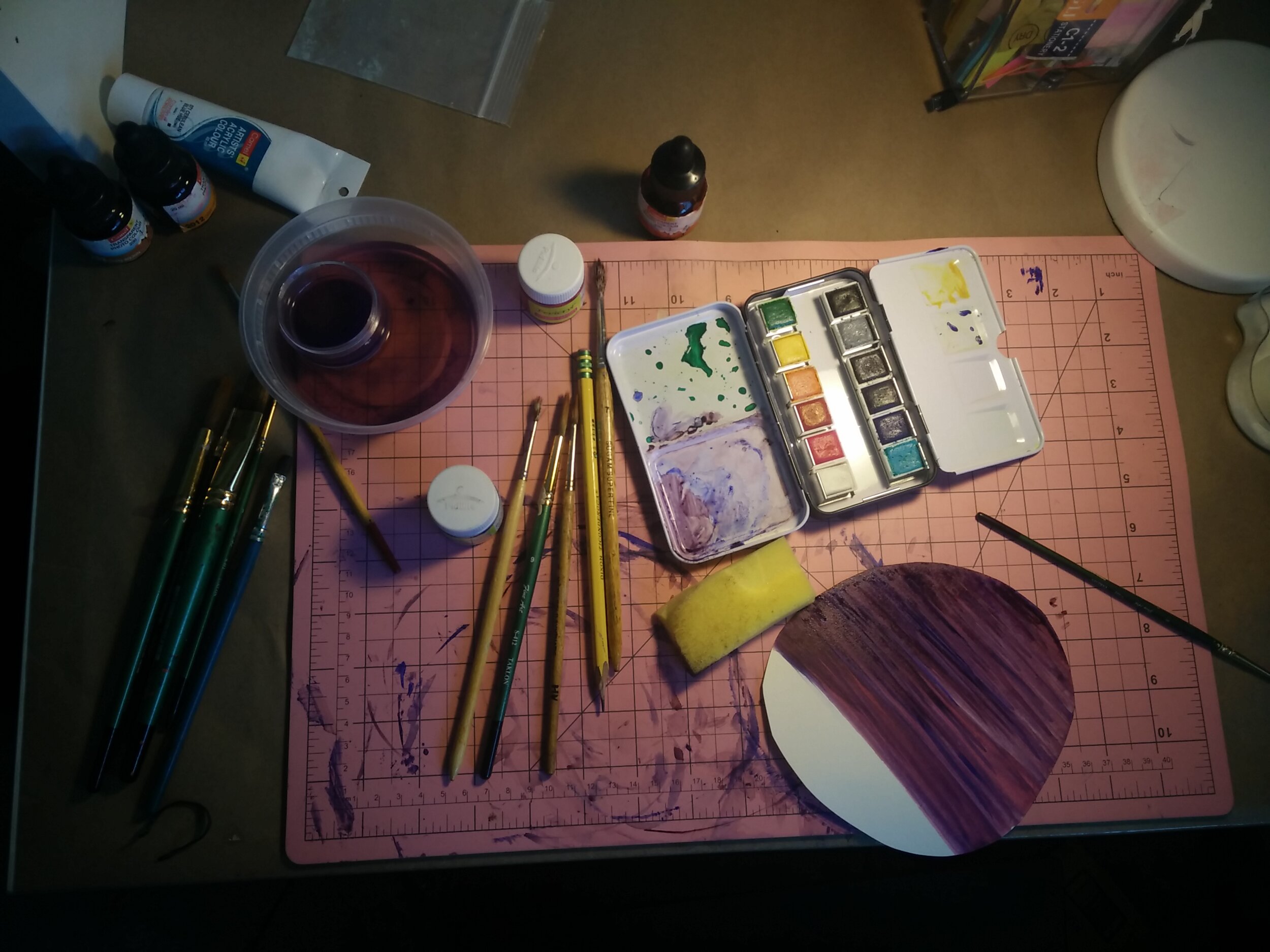
Design and Craft drove the making process and expressed the concept of 'Daag' within their mediums. Photography is the next medium I worked with to showcase the finished jewellery objects. For this medium, I had to see the objects through the eye of the camera. Everything inside the frame had to tell the story of the object. For this reason working with a simple plain background was out of question. I wanted everything with in the frame to reflect two main things - 01. The concept of 'Daag' - keywords : Folds, Layers, Stack. (Check the previous post : Making of 'Daag'). 02. The handmade aesthetic. I went through a couple of attempts to capture the narrative of the concept. Each cycle went like this: set up, photoshoot, edit, discard and repeat. But each cycle helped me fine tune the next, carrying lessons forward.
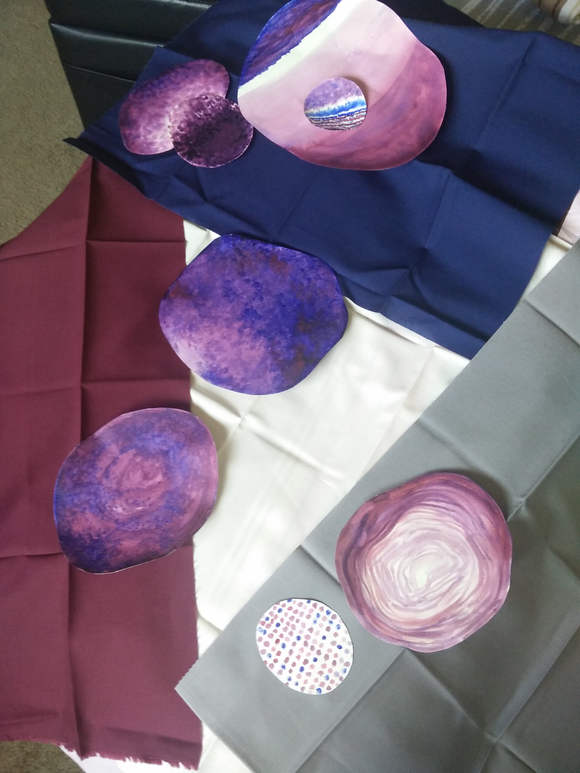
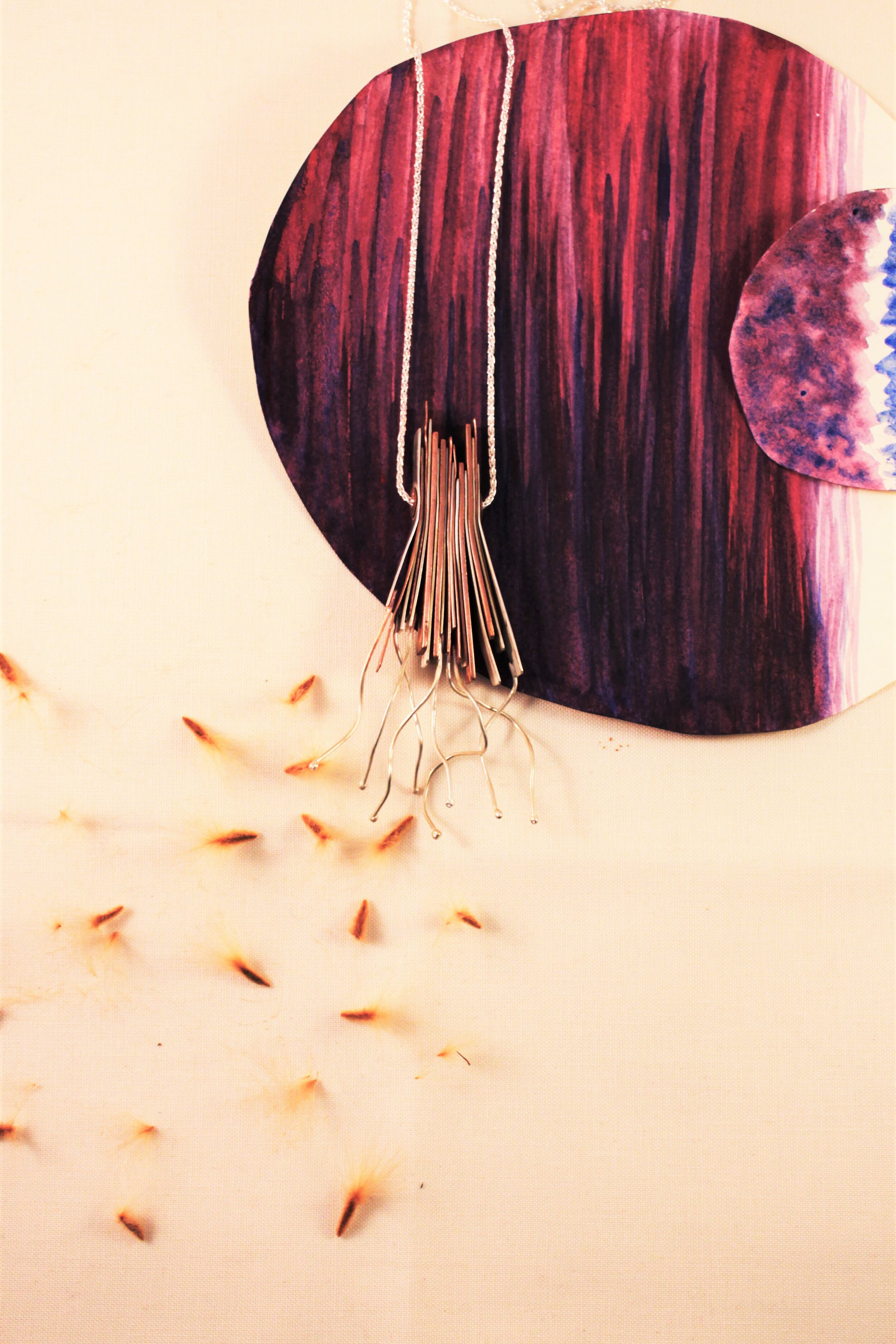
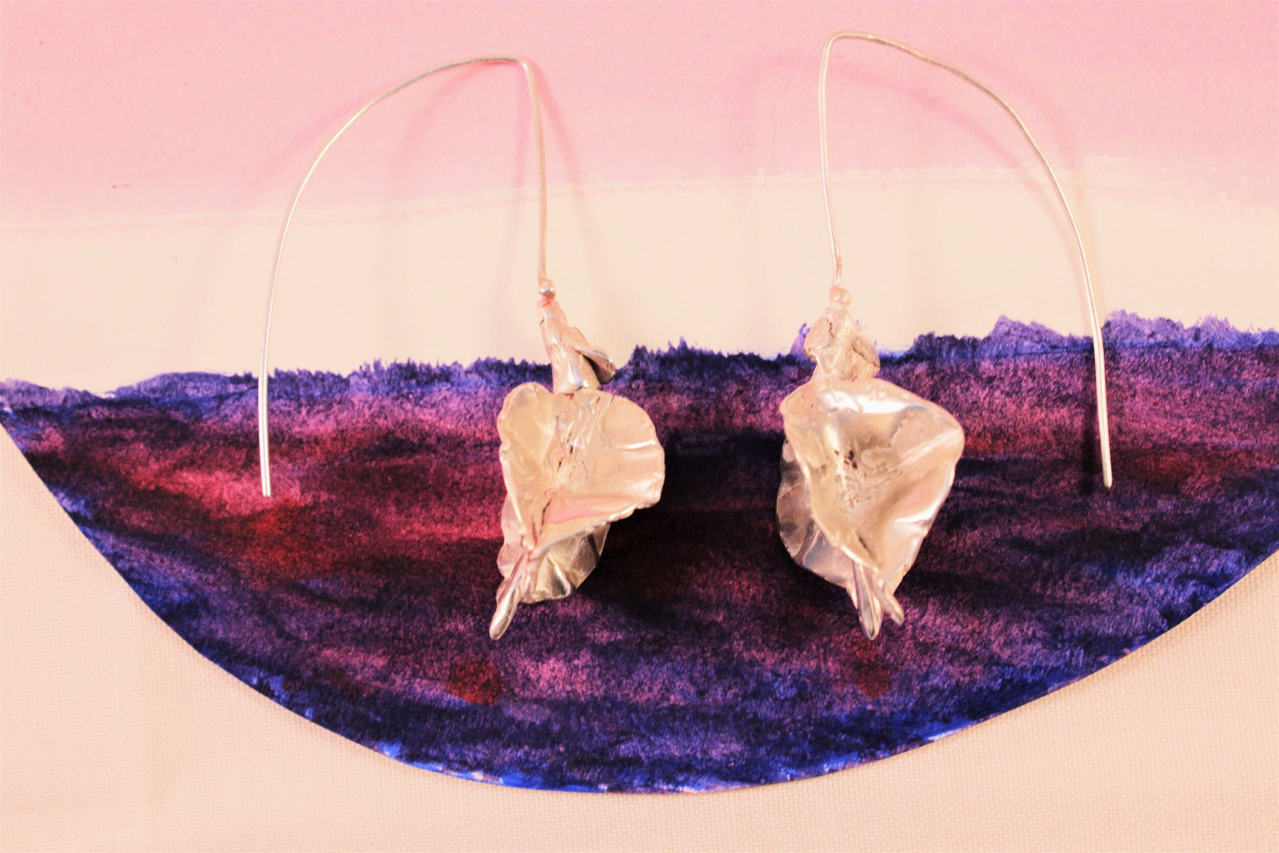
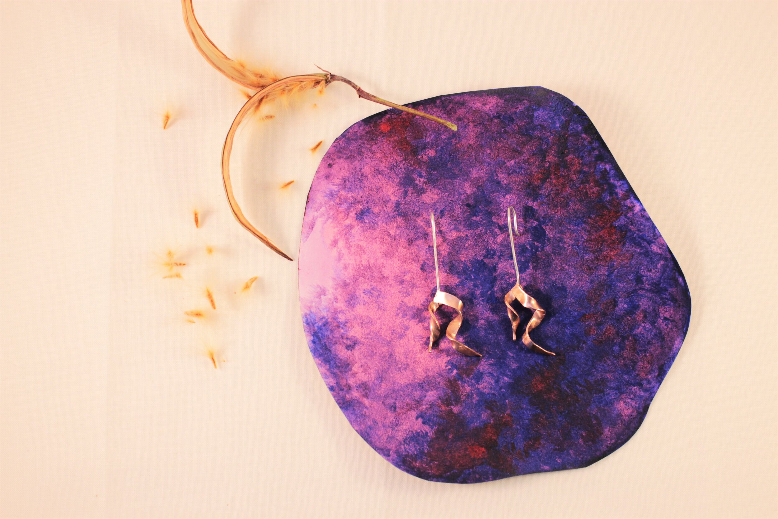
In my first attempt, I chose to work with water colours and paper. I cut the paper into organic circular shapes of different sizes. The sheets of paper were meant to be stacked (keyword), so the object to be placed on top of the pile. This eliminates the flattened quality that plain backgrounds have. The painting was to emulate layers and folds (keywords). I enjoyed the process of painting and shooting, although I wasn’t very happy with the final images. The painting overpowered the objects. There was way too much going on. The following images were the result of the shoot.
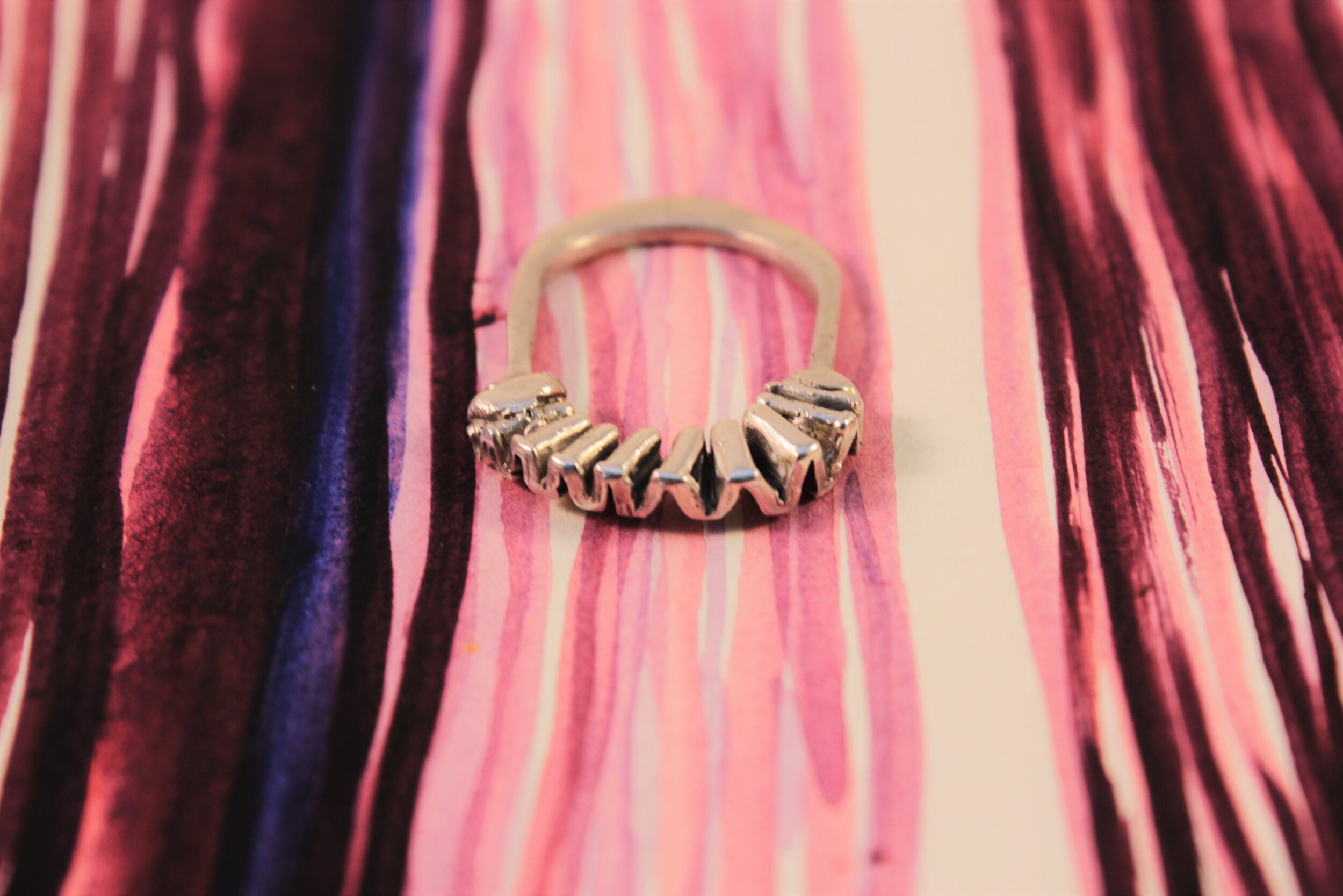
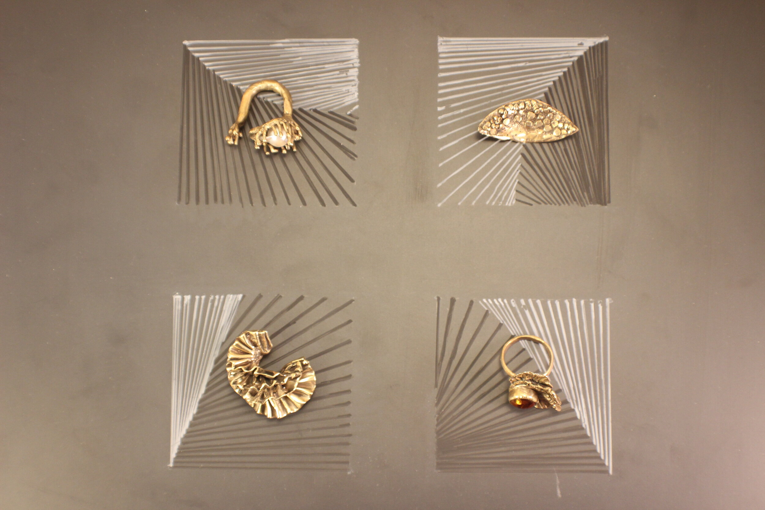
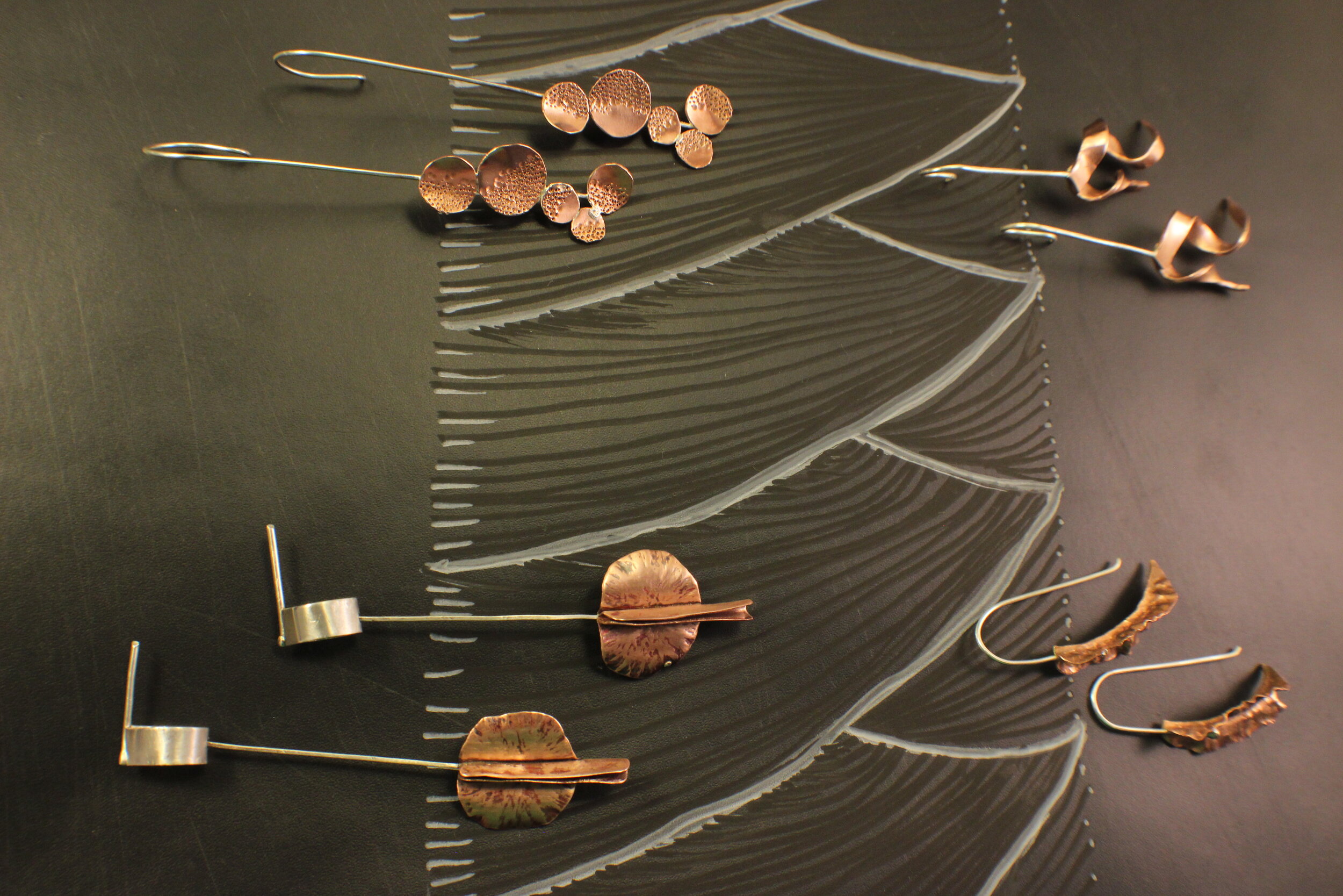
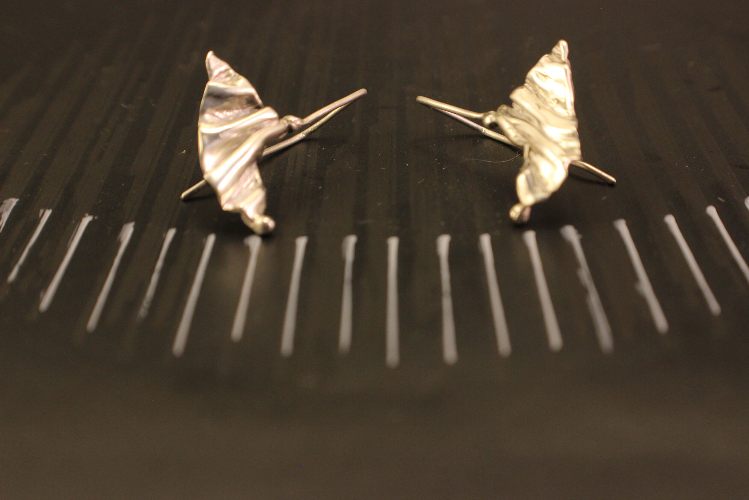
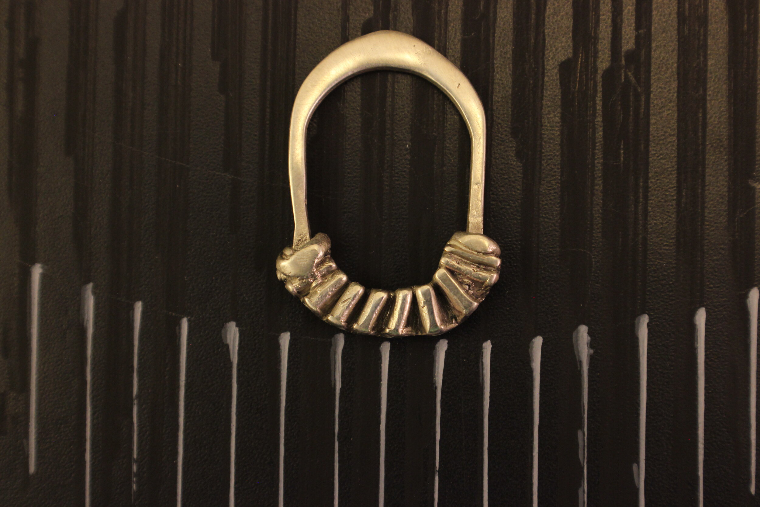
The next attempt was working with a chalkboard. I liked the ephemeral quality of the chalk drawings. The dark surface also provides a good background for the objects to be placed in. I wanted to draw around the objects. The following images were part of that photoshoot. The drawings were still overpowering but silver lining is I really liked the aesthetic of the chalkboard and decided to stick with it. Lessons : Be even more Minimal. The organic forms of the drawing was in line with the concept, but the objects blended in, instead of standing out. So I decided to contrast the form, and go the geometric way.
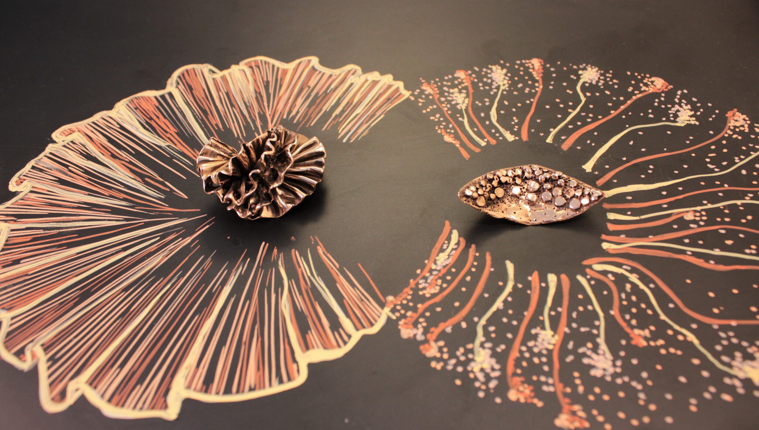
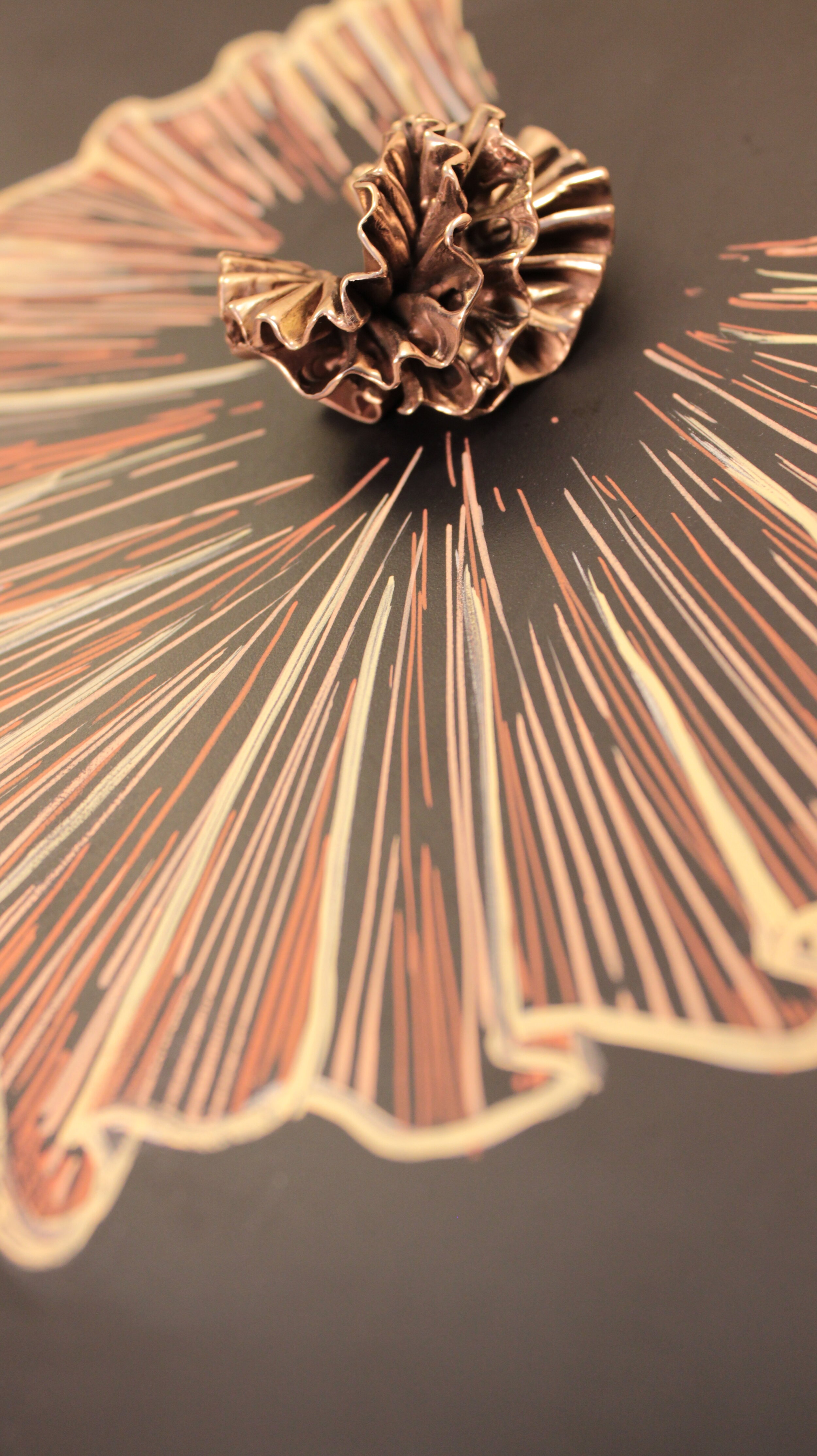
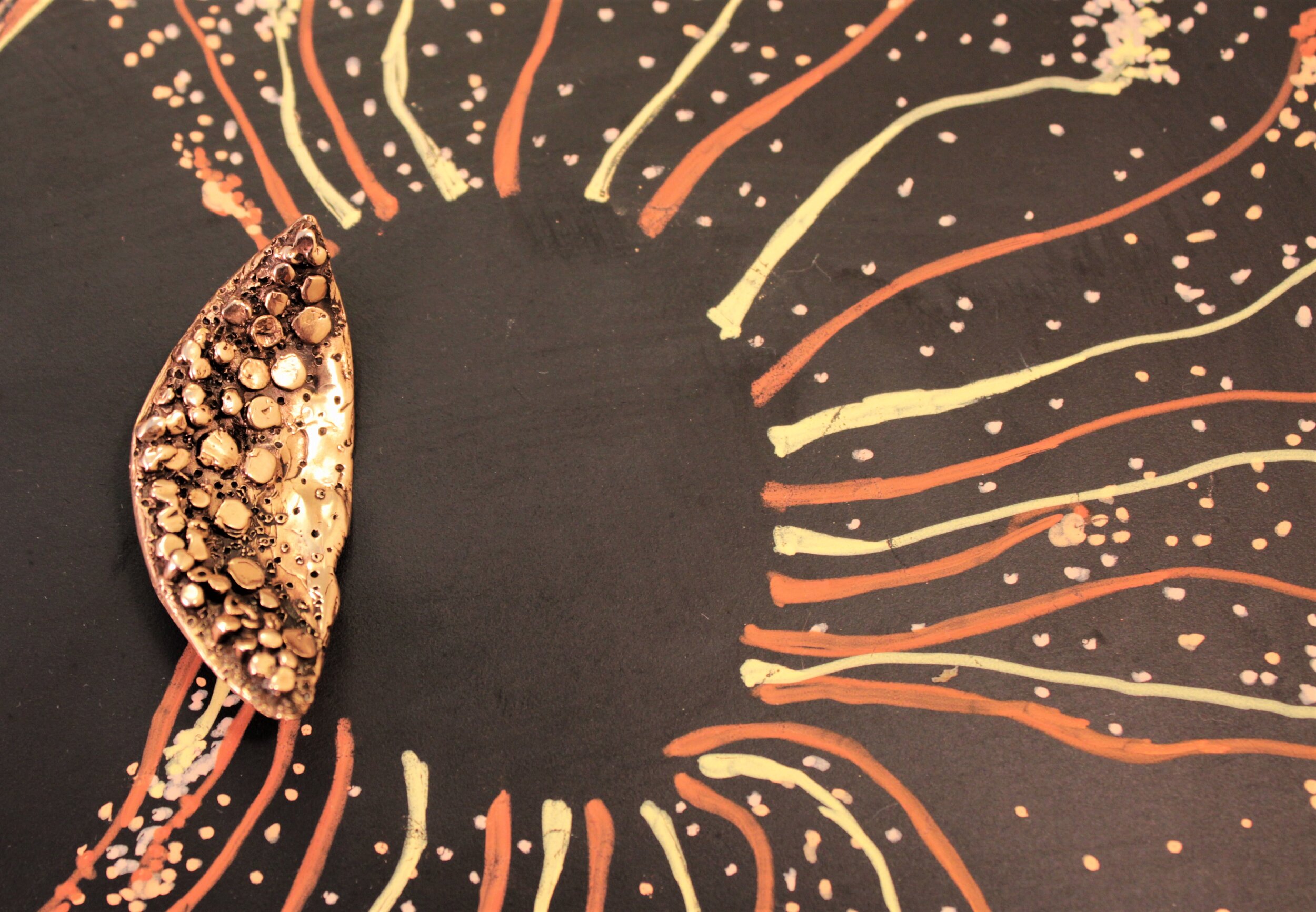
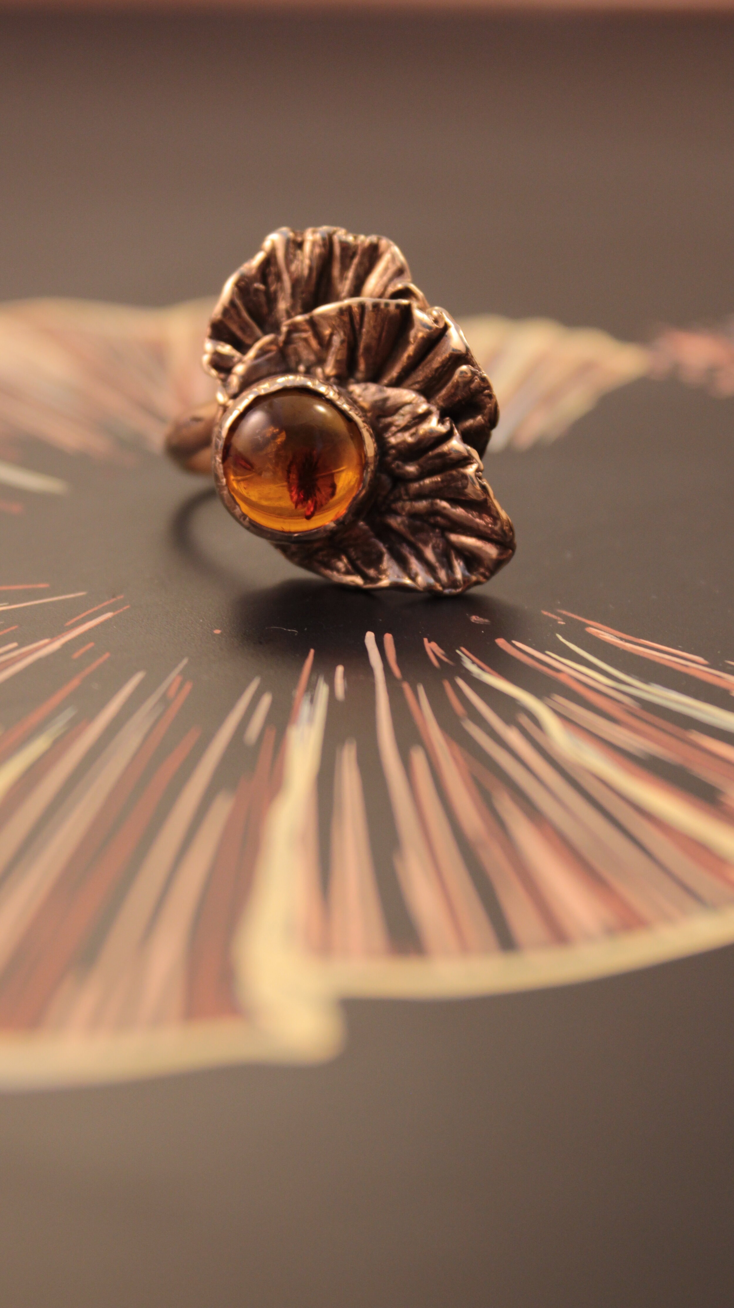
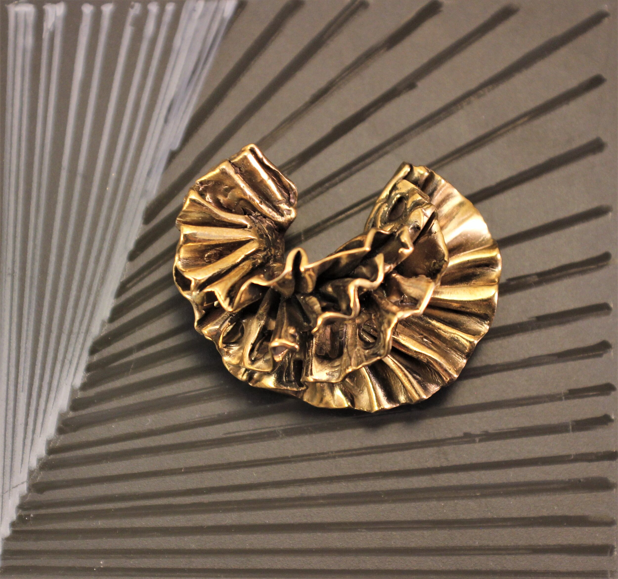
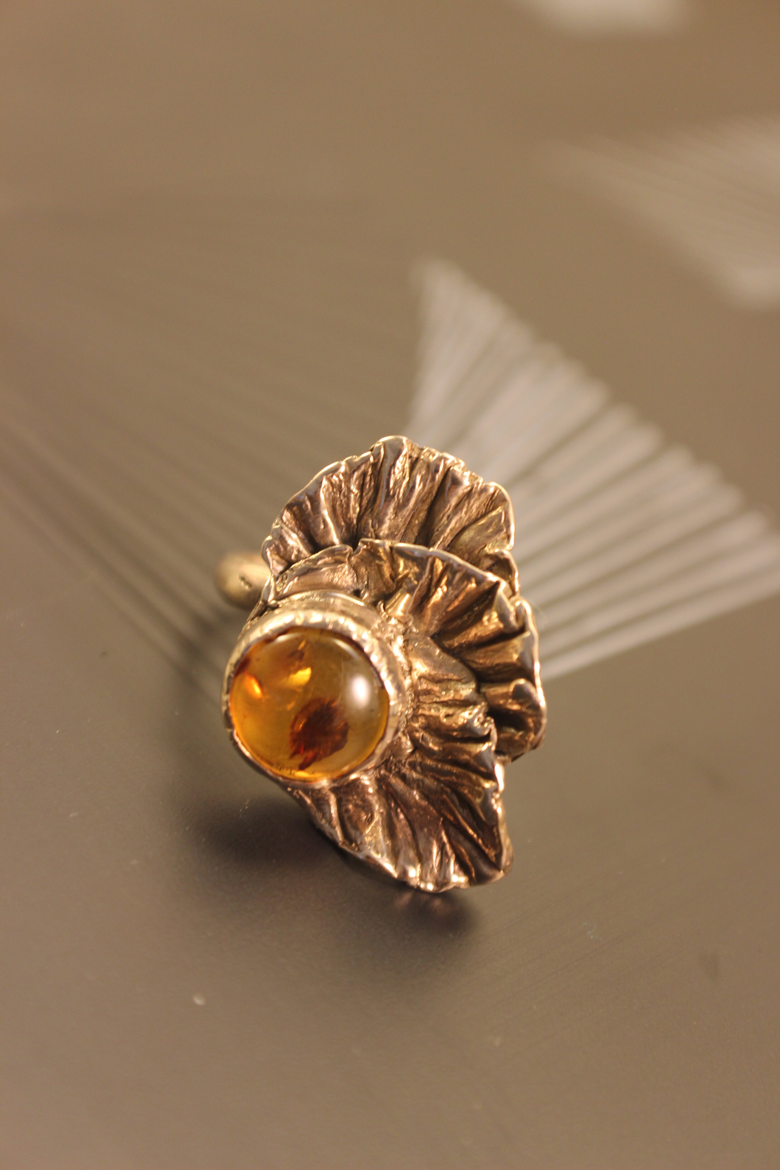
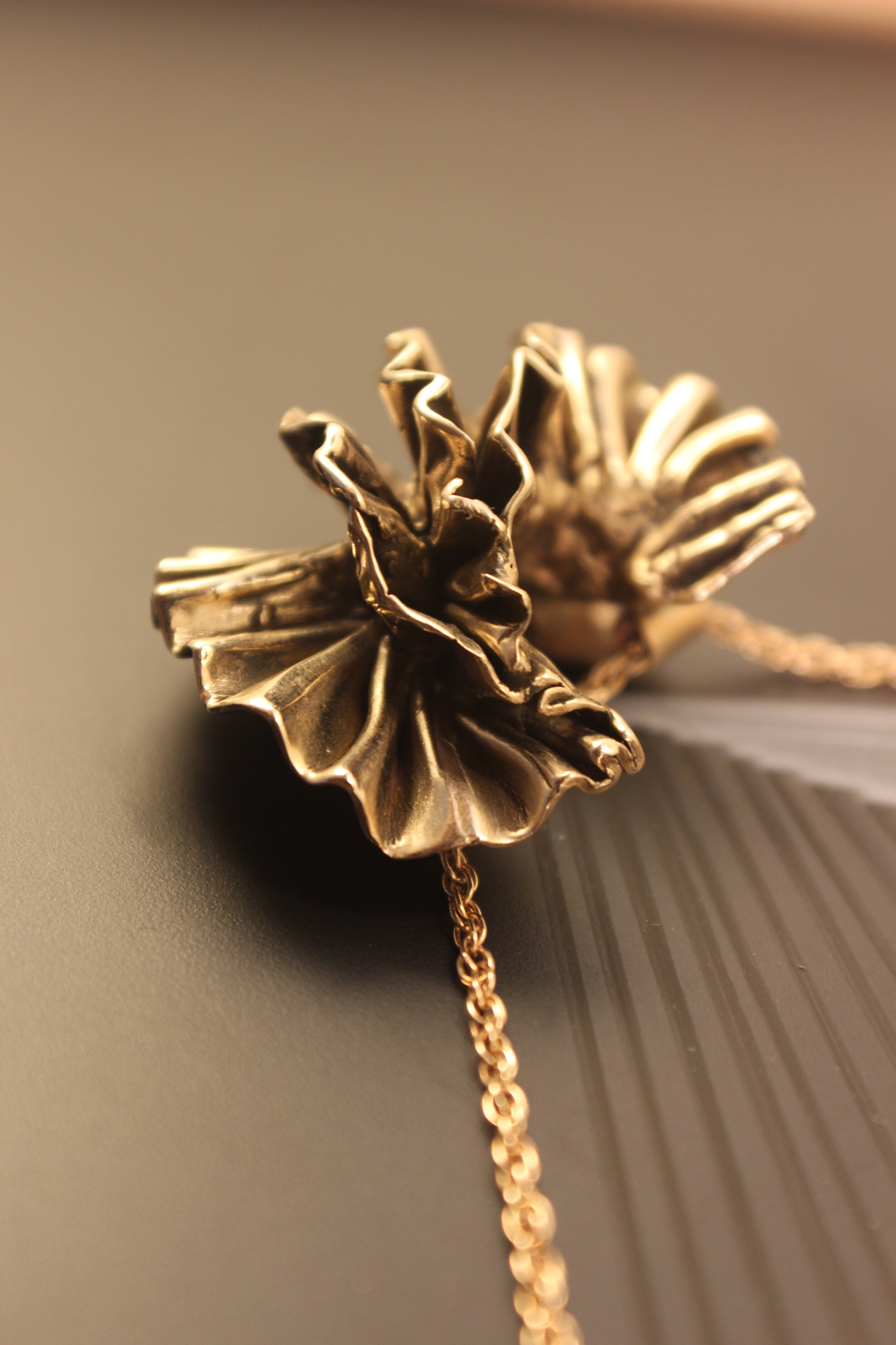
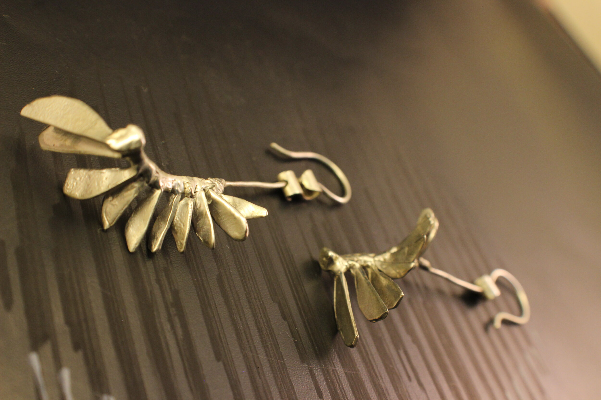
The last photoshoot. I was finally happy. There were basically 3 chalk drawings, that held the space for the objects to be placed in. It corresponded with the 3 different materials used in the collection - Bronze, Sterling silver and Copper. I used black and grey chalk colours, so the drawing wasn't too overpowering. I like the texture, black chalk makes on black chalkboard. As you can see I think it worked out pretty well.
The peices of this collection are all sold out.